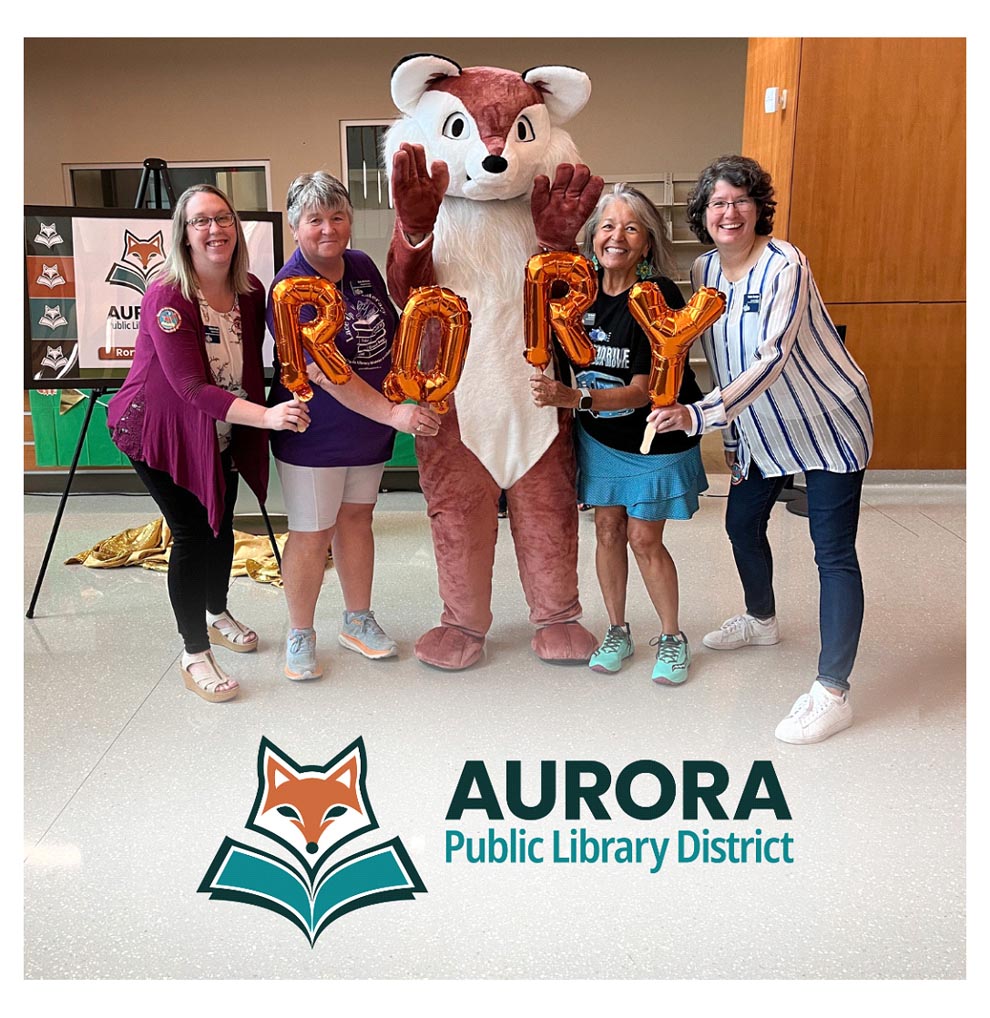

After months of planning, the Aurora Public Library District was thrilled to unveil our new branding with the public earlier this month during our Summer Reading Adventure Kick-Off Party. Hundreds of customers joined us at the Santori Library to see our new logo, meet our new mascot, and learn about why this was the right time to make these changes.
The previous logo had been in use for the past eight years, so we were ready for something new! With recent exciting changes (our new Bookmobile) and more on the horizon (Eola Road Branch renovations), it made sense to evolve to a look that better represented us. “After eight months of work, seven committee members representing all APLD locations, sixteen logo versions, one design company and countless feedback, we landed on a brand and logo that we hope you feel embodies you, your library, and your community!” Director of Marketing and Communications Miriam Meza-Gotto stated at the unveiling. APL Foundation board members joined the Communications Department as we lifted the sparkly curtain on the new logo and spelled out our mascot’s name, Rory, in orange balloons. The waiting crowd was delighted to see a larger-than-life Rory make a surprise appearance at the event! Children clambered to Rory for photos, hugs, and high-fives.
It’s been wonderful to see the community embrace our new fox mascot with such open arms! “I was part of the library’s contingent at the Pride Parade and it was so great to hear parade-goers chanting, “RORY, RORY”!” says Executive Director Michaela Haberkern. Even library staff members were transported back to their childhood when we introduced Rory before the public reveal, posing for photos with huge smiles. “It’s exciting to see Rory come to life! You can’t help but to hug Rory!!” said Senior Manager of Children’s Services Monica Boyer. Our staff has been very receptive to the new brand and are eager to see it fully incorporated into our promotional and marketing materials. “People love the warm colors of the new brand and of course, the fox with its nose in a book!” adds Haberkern.
This new logo was based on the desire to have a design that was attention-grabbing, contemporary, and that clearly portrayed our library. “The library and the community are growing and changing together, and it makes so much sense to let that show in the way we present ourselves to you.” adds Meza-Gotto. The focus is centered on our community with the large font size emphasizing AURORA above all else. This play in text sizes represents growth and includes font styles that seamlessly support translation into various languages and is friendly for our neurodiverse community. The desaturated color palette is inspired by nature and the fox embodies progress and innovation, urging viewers to embark on a journey of discovery and growth.
We were ready for this transformation and are eager to serve the community in new and exciting ways. Whether you are a regular library visitor or not, we hope you get a chance to see these changes in person, meet Rory at a library event, and share the excitement with us as the future unfolds!
Andrea Tiberi is the communications coordinator for the Aurora Public Library District.